Self publishing has its drawbacks and advantages, and sometimes both are rolled into one. Having control of the editing process is both a gift (nobody can force you to change anything in your text) and a nightmare (maybe you should have changed something in your text!), having control of the price is both good (hey, you can lower the price to sell more, then raise it the next day to earn more) and bad (hey, maybe you shouldn’t have lowered the price, you’re not earning anything), and so on.
Same thing with covers. Having total control of your cover is a fantastic thing. When you’re published with a traditional publisher, you have little to no control over your cover. Sure, you can send in your suggestions, and hope that, a) they are taken into consideration, and b) if they’re taken into consideration, that it be done with talent and inspiration and not simply as a list of objects to put together on a page (hey, she wants a horse! here, a horse, next to it a mountain, and a woman. Presto!)
Now, if you’re self publishing, you can pay a good artist to make you a great cover. If you have the money, that’s the best solution. Sometimes, if you’re lucky, you’ll find gems, great artists trying to make themselves known who offer affordable prices.
Or, you might want total control of your cover and be crazy like me, and make your own covers. Because, you know, I’ve always wanted to do that. Even if I have no training in graphics.
Total nuts.
But I’m nuts with good and talented friends who step in to help me.
This time, for the sequel of Rex Rising – Rex Cresting – I decided that I wanted to keep the same face and use the other half…
First reaction:
Friend: Oh no, this looks exactly like the cover of Rex Rising!
Me: Um, I know, but I will add things to make it different…
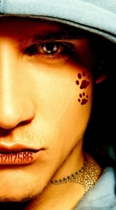
Then, I wanted to add references to a cat on the cover, since a cat plays a role in Rex Cresting, and also certain numbers, very important ones. For the cat, after much deliberation, I decided to use paw prints. From a cat. Right.
Friends (omnibus): Er, Chrys. This is like a cover for children. Cute, yeah, but… Not what you need.
Me: I want paw prints!!!
Friend: Yeah, I know sweetie, I understand, but it looks cutsie, it’s like for kids, you know, boy scouts…
Me: Paw prints! I want!
Friend: okay, calm down. Here, have some paw prints. 🙁
Here:
Me: Omigod, look, a pawprint on his cheek, how cute is that! Squee!
Friend: Ahem, yeah, as I was saying, too childish.
Me: I want!
Friend: Sigh…
Okay, I thought, I’m sure they’re all wrong and I’m right (surprise, huh!). All I need to do is change the position of the pawprint and all will be well. Also, I will place the all important numbers on his lip – yes, on his mouth. Why, isn’t that a great idea?
Me: squee!
Friend: okay, not changing your mind, are you? *heavy sigh* Well, at least let me work on it and mold the numbers and paw prints on his face? *desperate plea*
Me: squee again! Thank you, Jean!!!
Beautifully done, both the numbers and the paw prints – yet the response was the same – childish. Not what you need.
Me: But I want!
Friend: Think again.
Me: aaaargh! You’re right… 🙁
Difficult to accept that my first instinct wasn’t the best, although I set my foot down at changing the image for another – which may be a mistake, but I’m too much of a mule to concede. 😀
So, enter another wonderful friend with her wonderful partner (thank you Ty and Dave!) who offered to try out some other effects for me.
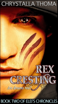
Still stuck on the idea of the cat, I asked him for scratches from the cat’s claws (are you laughing yet?) and again for the darned numbers, because I’m more than just a mule – I’m the worst mule you ever met!
The results were beautiful!
So I was looking at these, top quality work, beautiful… And they didn’t do what I wanted – and worst of all, they weren’t taken from the book. In the book he doesn’t have numbers on his lips or scratches on his cheek! I wanted the elements in the picture, but they weren’t working.
Then I remembered something else, something from the book itself, and here things finally clicked. 🙂 So it is with great pleasure and pride – and with heartfelt thanks to my wonderful friends who made this happen – that I present to you the cover for Rex Cresting, due out at the end of February:
Friends: Coolness! 🙂
Me: I have the best friends in the whole world…. 🙂


You’re welcome. 🙂 I’m so glad you finally got the cover that worked for your story. It was a process for sure, but hey, we all had fun along the way. 😀
Thank you so much for your help!!!!!!!!!!!!!!!!! 🙂
This was such an entertaining post. And I love your final cover! 😀
Thank you! It was both a funny and nerve-wracking process!
I really enjoyed Rex Rising and I’m excited for the next one! ^^
I’m very glad to hear that. Be sure to check this blog around the end of the month for an update and release date. 🙂